An extremely competent crisis management team required a taxing crisis training scenario incorporating several different problems.
As an independent consultancy firm, Hard Rain wanted to set itself apart from its industry competitors dealing with crisis management and crisis communications.
Kerry from Knight Media Comms really grasped the Hard Rain brief. She immersed herself in the business and demonstrated a really fast learning curve. This enabled her to be both useful and insightful from early on. Kerry brings a special mix of first class writing with an eye for design all backed up by the experience to simply know what works. It’s a refreshing experience to work with her and her contribution has been invaluable. So much so that we’ve now brought her in to help on client work.
Carl Courtney | Hard Rain Founder
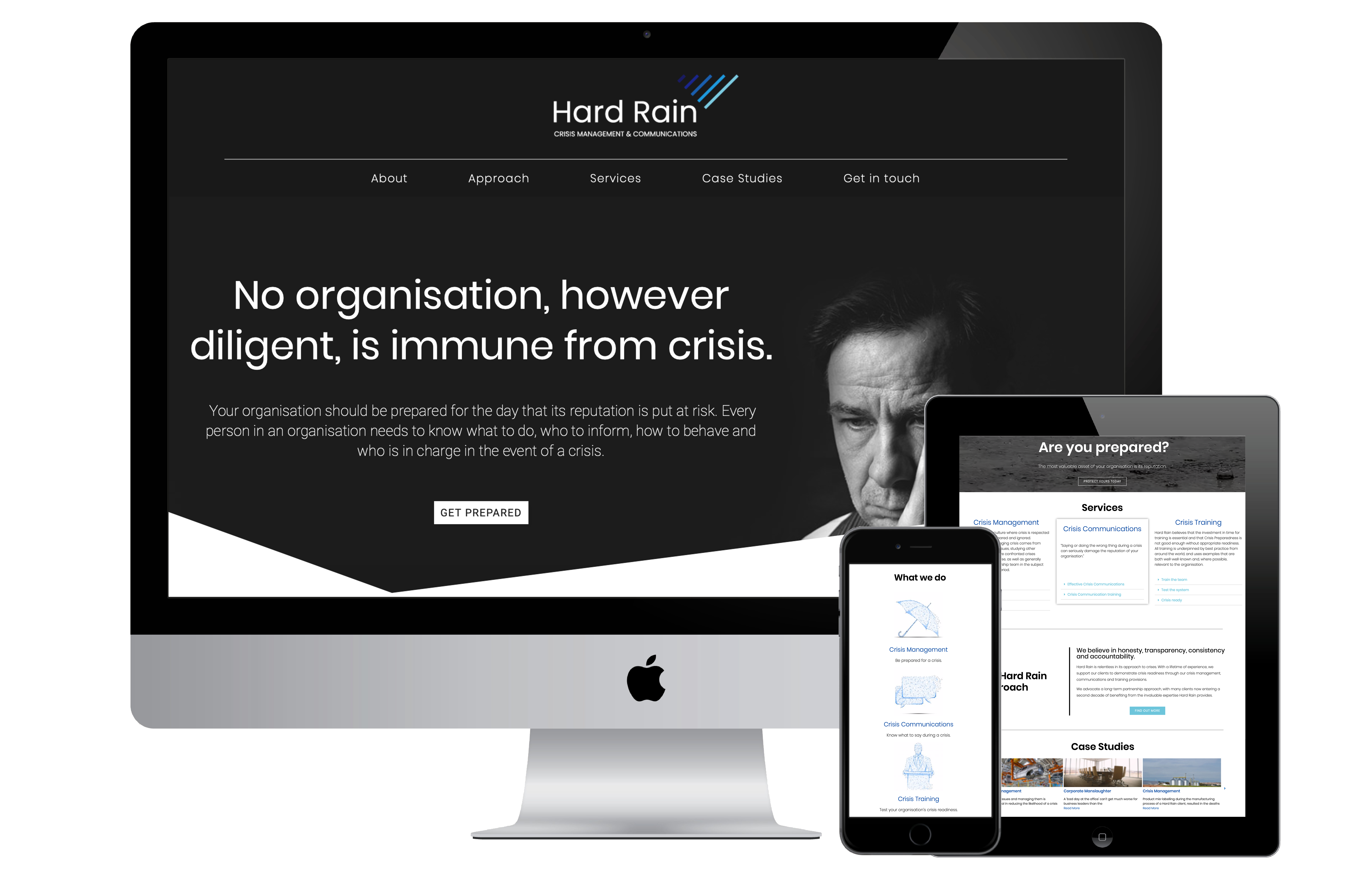
No organisation, however diligent, is immune from crisis.
After reviewing the first iteration of Hard Rain’s website copy, we identified some issues with regards to the company’s tone of voice and identity. Through an insight session with the client, we established the:
Given the work Hard Rain regularly undertakes for its clients, the design of the website needed to be powerful to encourage action. Whilst also being informative for users to quickly acknowledge the company’s breadth and depth of experience.
We kept the design simple with a predominantly black, white and blue colour palette. And used line illustrations, and monochrome imagery to visually support the website copy.
Finally, due to the volume of content required on the home page, we simplified the format with the use of lists and drop-down toggle features.


Hard Rain deals with some hard-hitting issues as a crisis management and communications consultancy. This means the type of language used by the company throughout its written content is crucial. Using the client’s comms identity guidelines, we produced copy that married a professional and authoritative tone, with a friendly and conversational approach.

An extremely competent crisis management team required a taxing crisis training scenario incorporating several different problems.

We created a contamination crisis scenario to train the India CMT at a multinational manufacturing company

A multinational design and manufacturing company required a series of media pitches to communicate a news story to the media on a global scale, including national newspapers and trade journals.
© 2019-2020 All rights reserved
Knight Media Communications Ltd | Company no. 12064990